You are here
> Home
> Projects
> CSS float left and clear left
How do CSS float left and clear left work?
These examples explore the Cascading Style Sheet (CSS)
float left
and clear left properties.
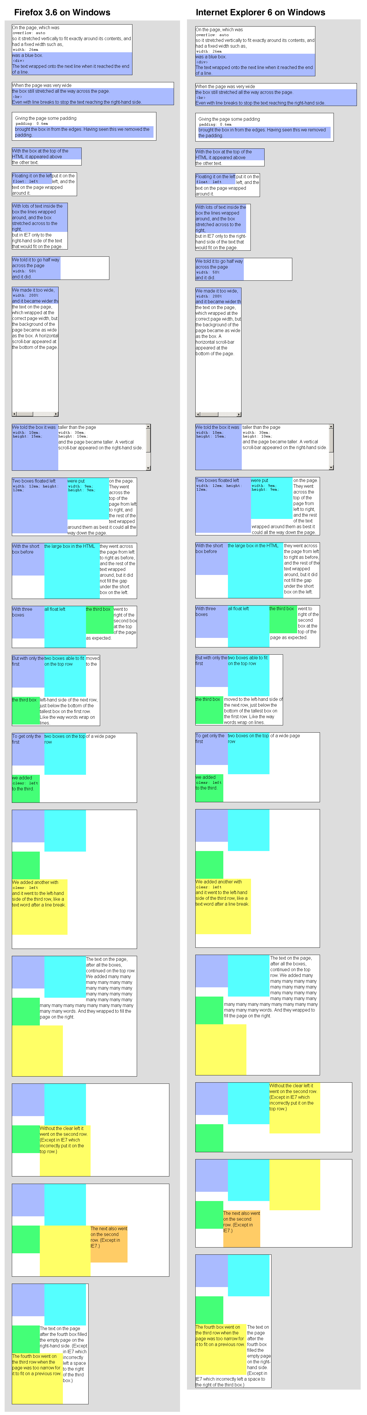
On the page, which was
overflow: auto
so it stretched vertically to fit exactly around its
contents, and had a fixed width such as,
width: 26em
was a blue box.
<div>
The text wrapped onto the next line when it reached the end of a line.
When the page was very wide
the box still stretched all the way across the page.
<br>
Even with line breaks to stop the text reaching the right-hand side.
Giving the page some padding
padding: 0.6em
brought the box in from the edges. Having seen this
we removed the padding.
With the box at the top of the HTML it appeared above
the other text.
Floating it on the left
float: left
put it on the left, and the text on the page wrapped around it.
With lots of text inside the box the lines wrapped around,
and the box stretched across to the right,
but in IE7 only to the right-hand side of the text that would fit on the page.
We told it to go half way across the page
width: 50%
and it did.
We made it too wide,
width: 200%
and it became wider than
the text on the page, which wrapped at the correct page width,
but the background of the page became as wide as the box.
A horizontal scroll-bar appeared at the bottom of the page.
We told the box it was
width: 10em; height: 15em;
taller than the page
width: 30em;
height: 10em;
and the page became taller. A vertical scroll-bar appeared
on the right-hand side.
Two boxes floated left
width: 12em; height: 12em;
were put
width: 9em; height: 9em;
on the page. They went across the top of the page from left to right,
and the rest of the text wrapped around them as best it could all the
way down the page.
With the short box before
the large box in the HTML
they went across the page from left to right as before, and
the rest of the text wrapped around, but it did not fill
the gap under the short box on the left.
With three boxes
all float left
the third box
went to right of the second box at the top of the page as expected.
But with only the first
two boxes able to fit on the top row
the third box
moved to the left-hand side of the next row, just below
the bottom of the tallest box on the first row.
Like the way words wrap on lines.
To get only the first
two boxes on the top row
of a wide page
we added
clear: left
to the third.
We added another with
clear: left
and it went to the left-hand side of the third row,
like a text word after a line break.
The text on the page, after all the boxes, continued on the top row.
We added
many many many many many many many many many many many many many many
many many many many many many many many many many many many many many
words. And they wrapped to fill the page on the right.
Without the clear left it went on the second row. (Except in IE7
which incorrectly put it on the top row.)
The next also went on the second row.
(Except in IE7.)
The fourth box went on the third row when the page was too narrow
for it to fit on a previous row.
The text on the page after the fourth box filled the empty page
on the right-hand side. (Except in IE7 which incorrectly left a
space to the right of the third box.)
This is how these examples render in
Firefox 3.6 and IE6 on Windows.